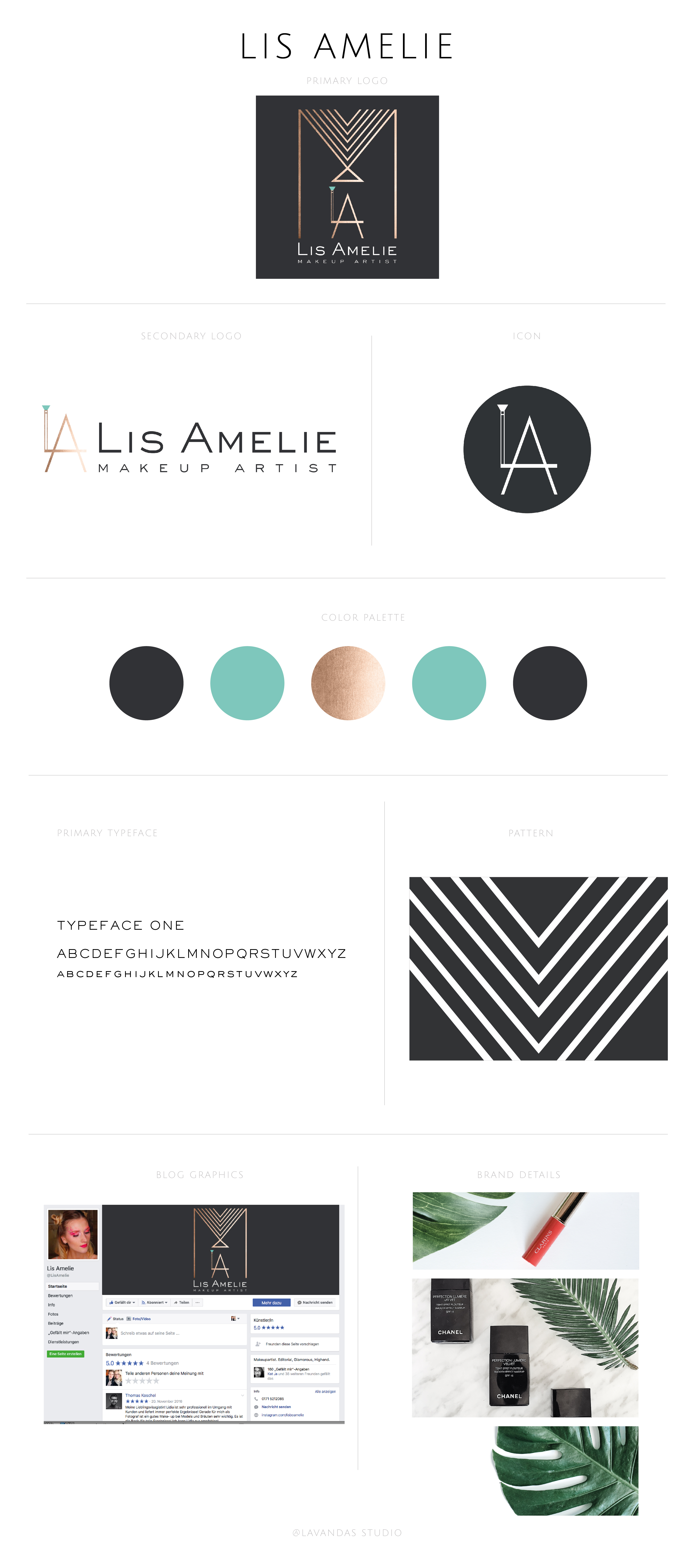
When Lidia came to me about her new logo and branding design, she already knew the direction she wanted to go. She even had the logo icon drawn out on a piece of paper. It had to be something simple and elegant with an edge. She loves metallic, so we decided on rose gold which goes very well with everything she already had. We also wanted to add just a little bit of color to make it pop and went with a beautiful mint color. Just perfect for the dark grey and rose gold. It was fun to recreate the icon on Illustrator and from there on play with the pattern for the rest of her designs. Isn’t it beautiful? I love how it turned out.
You can find more of her work on FACEBOOK, INSTAGRAM, and YOUTUBE. Pay her some visit and say hello. :)
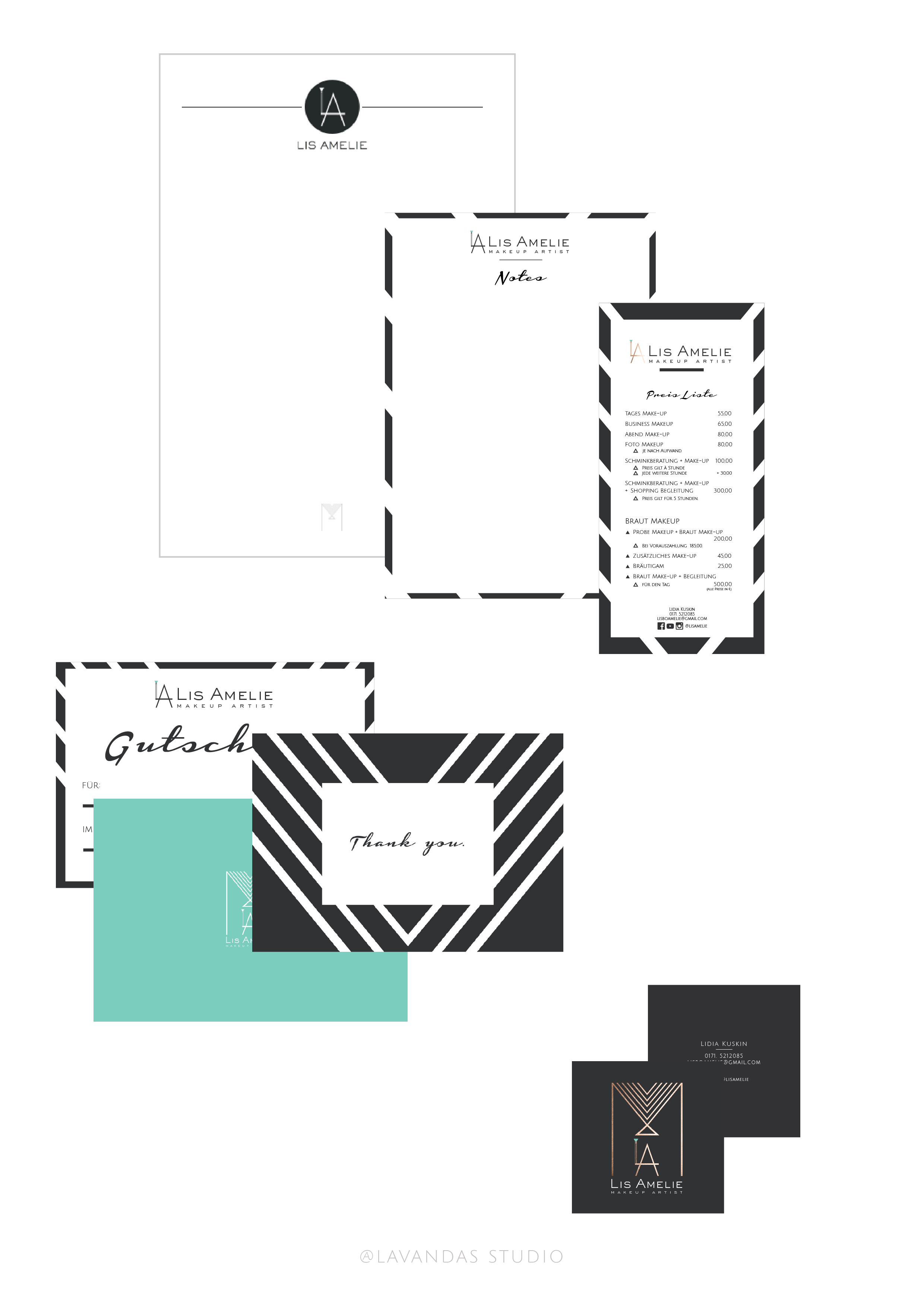
After the logo was designed we sat down and made a list of the things that she would need for her clients and for a comfortable and productive workplace. This is what we came up with.
I hope you enjoyed this little insight into my design work.
Dream big.
